holidaycheck travel wallet
Revamped the HolidayCheck app into a “Travel Wallet,” offering users seamless access to travel documents, flight details, and bookings, boosting engagement throughout their trips.
00
problem
HolidayCheck’s mobile app lacked the features users needed for a complete travel experience. It was essentially a copy of the website, with limited mobile-specific functionality. Users expressed frustration that the app didn’t offer essential travel tools, like storing travel documents, flight and accommodation details, or offline access. This gap in functionality caused low engagement, with users not seeing the app as useful for their trips, leading to fewer installs and limited active use during and after their travels.
solution
To solve this, we embarked on a complete overhaul of the HolidayCheck mobile app, focusing on transforming it into a “Travel Wallet” — a personal travel assistant in users’ pockets. The goal was to design a mobile experience that would be relevant at every stage of the user journey: from planning and booking a trip, to preparing for it, exploring destinations, and sharing experiences post-trip. This would not only drive more downloads but also ensure daily active usage and engagement post-travel. We adopted a modular approach, ensuring flexibility for future updates, and aimed to create a UI that was intuitive, visually appealing, and scalable across devices. The core of this new experience was ensuring that users could access all their travel information without needing constant internet access, while also allowing them to plan and book future holidays directly through the app.
Our journey began with in-depth user research, exploring the existing user journey and identifying pain points. The feedback was clear: users wanted everything they needed for their travels in one place, easily accessible from their phones. Armed with this information, I worked alongside our PM and UX Researcher to create user personas and new journey maps, which became the foundation of our design process.
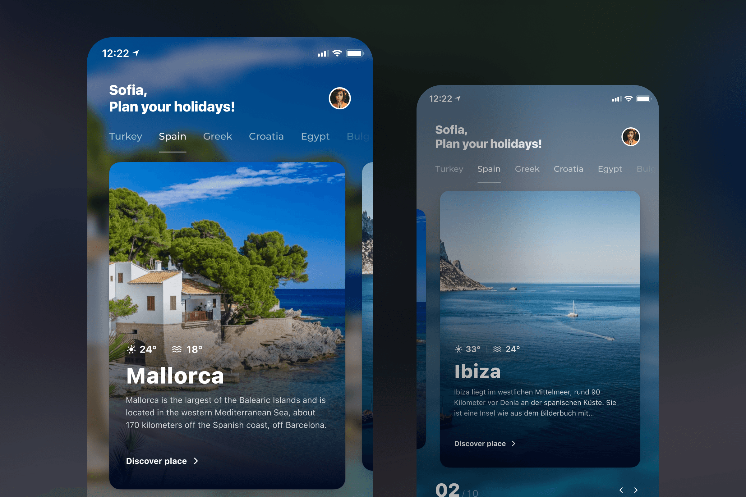
The first step was creating a clickable prototype using the app’s existing style to test our assumptions. We knew we wanted to create something new and exciting, but testing was essential to ensure we were on the right track. The early tests were promising, but there was still work to be done. Through five iterations, each prototype improved upon user feedback, ensuring that we refined the most critical aspects of the app. This iterative approach allowed us to keep costs and time in check while constantly improving the user experience.
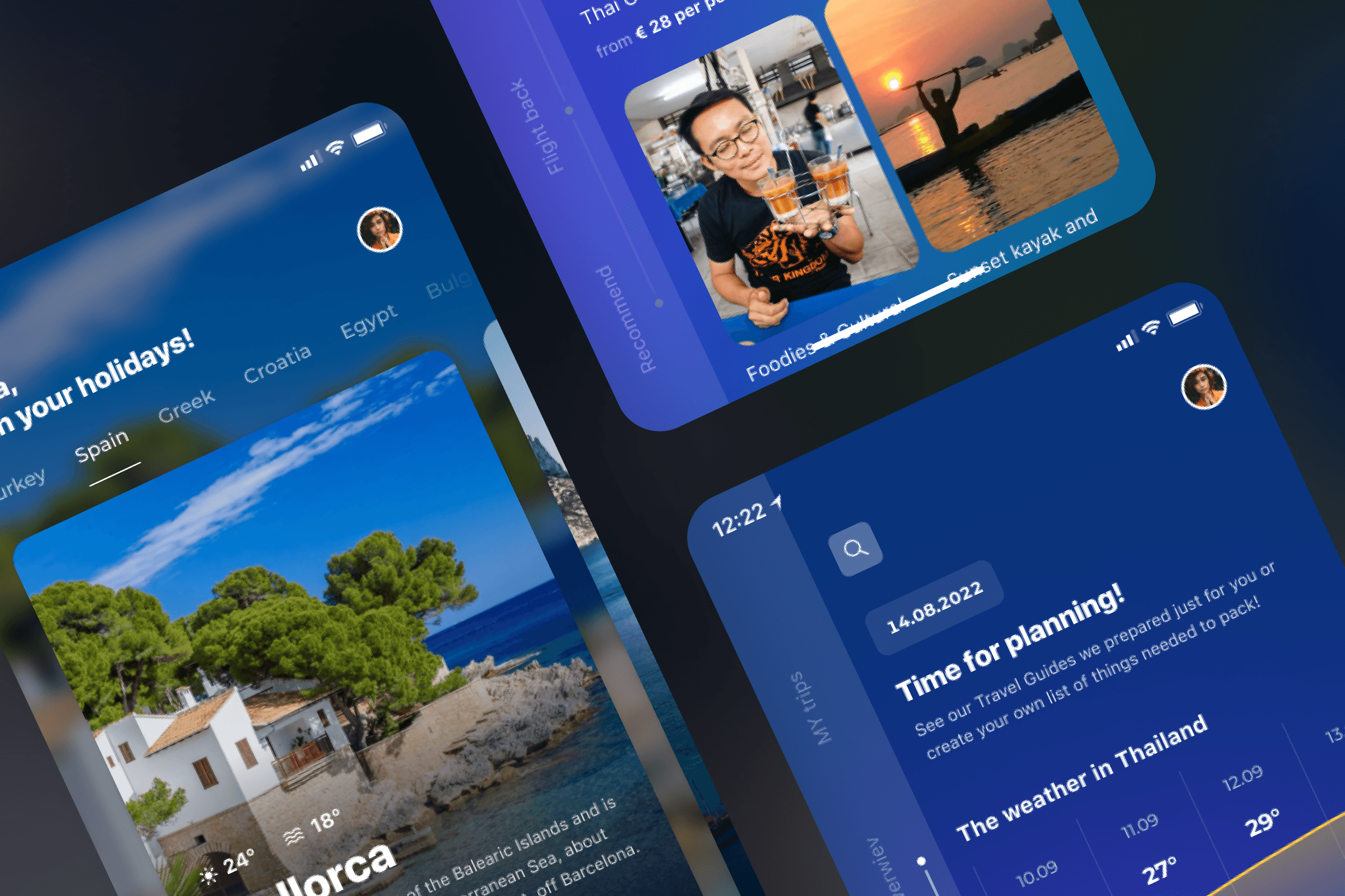
Once we were confident in the direction, we started development on the MVP. A select group of users was given early access to test the Travel Wallet in real-world conditions. During this phase, we addressed minor issues quickly, thanks to the technology used in the project. Simultaneously, I started working on a more polished, final version of the app. My vision was to create a fresh, memorable interface that was modern, visually appealing, and easy to use, using HolidayCheck’s branding colours in a vibrant, engaging way. We moved away from a text-heavy, monotone design to something that prioritised visuals, knowing that users typically engage with images before reading text.
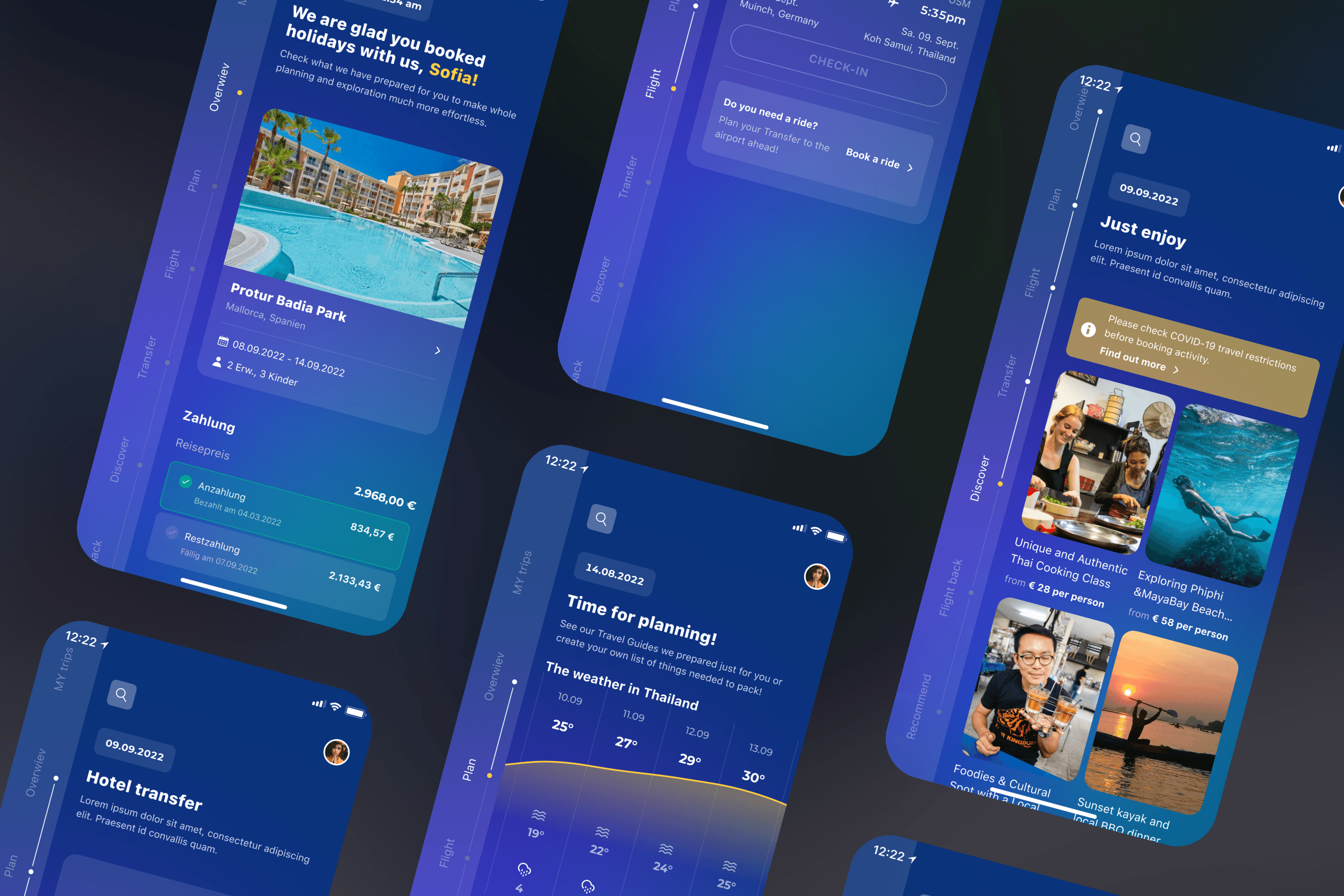
After completing the design of the new app, we tested it with users again, and the feedback was overwhelmingly positive. The app not only met user needs but provided an experience that felt innovative and fun to use.
Conclusion
As product designers, it’s essential to always listen to users and their needs. Every project should have a broader goal, but we must remember that we’re designing for the user, not ourselves. By stepping into the user’s shoes and asking, “Does this look and work the way I, as a user, would expect it to?” we ensure that our designs meet real needs. An iterative process helps us avoid many pitfalls, allowing us to build a better product faster. The redesign of the HolidayCheck app was a success, and the Travel Wallet became a key tool for users, keeping them engaged before, during, and after their travels.
01
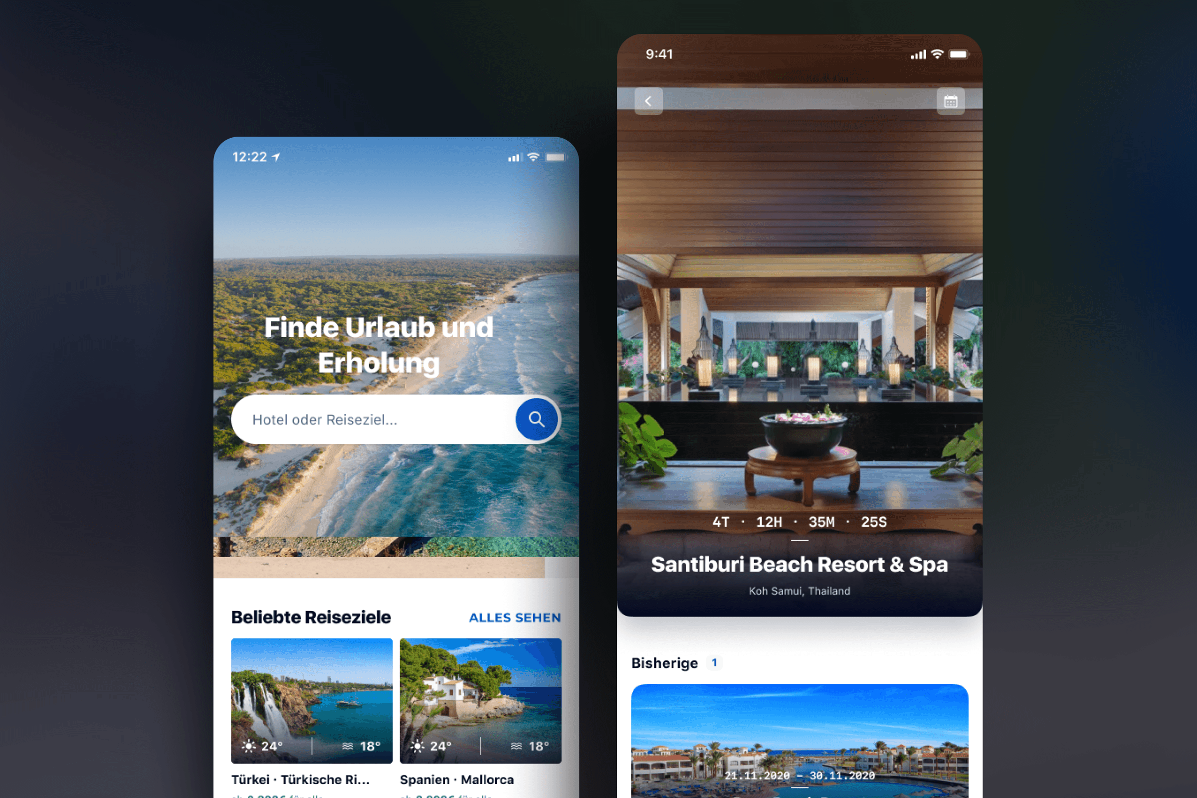
Our first user test prototype, created to validate our initial hypothesis and gather feedback
02
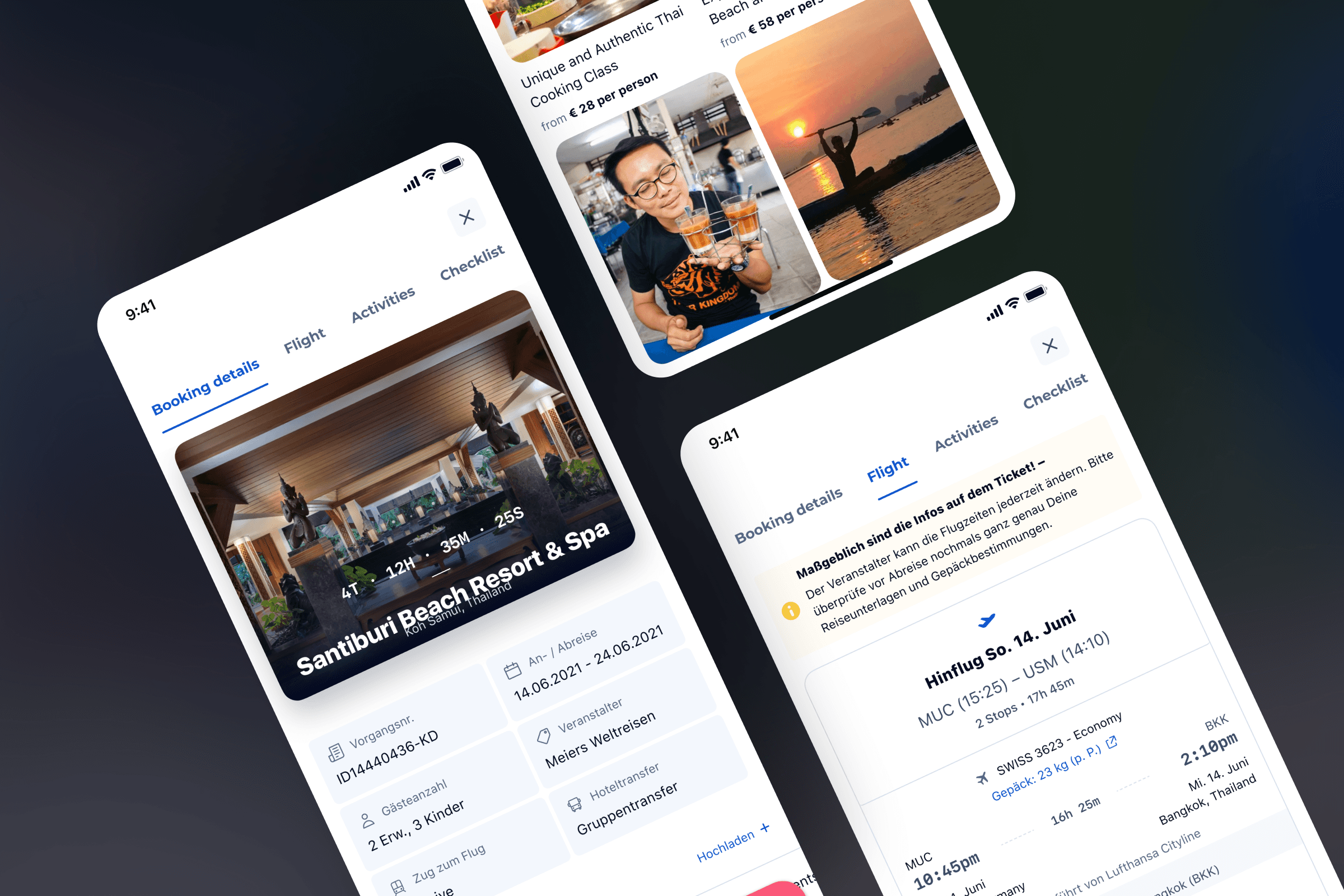
Selected screens from the high-fidelity prototype tested in the second iteration, refining the user experience
03
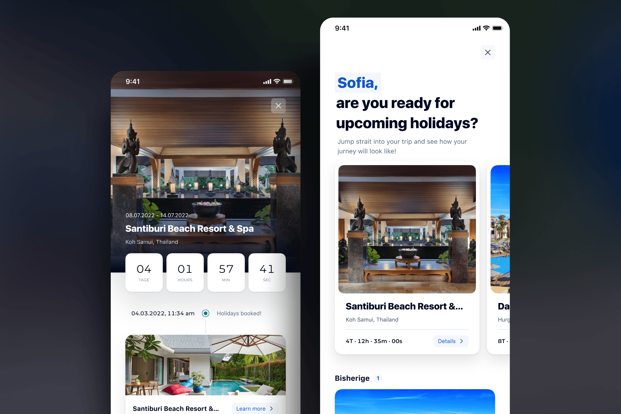
High-fidelity prototype screens showcasing the trip timeline approach we integrated into the feature
see also
