virtual event experience
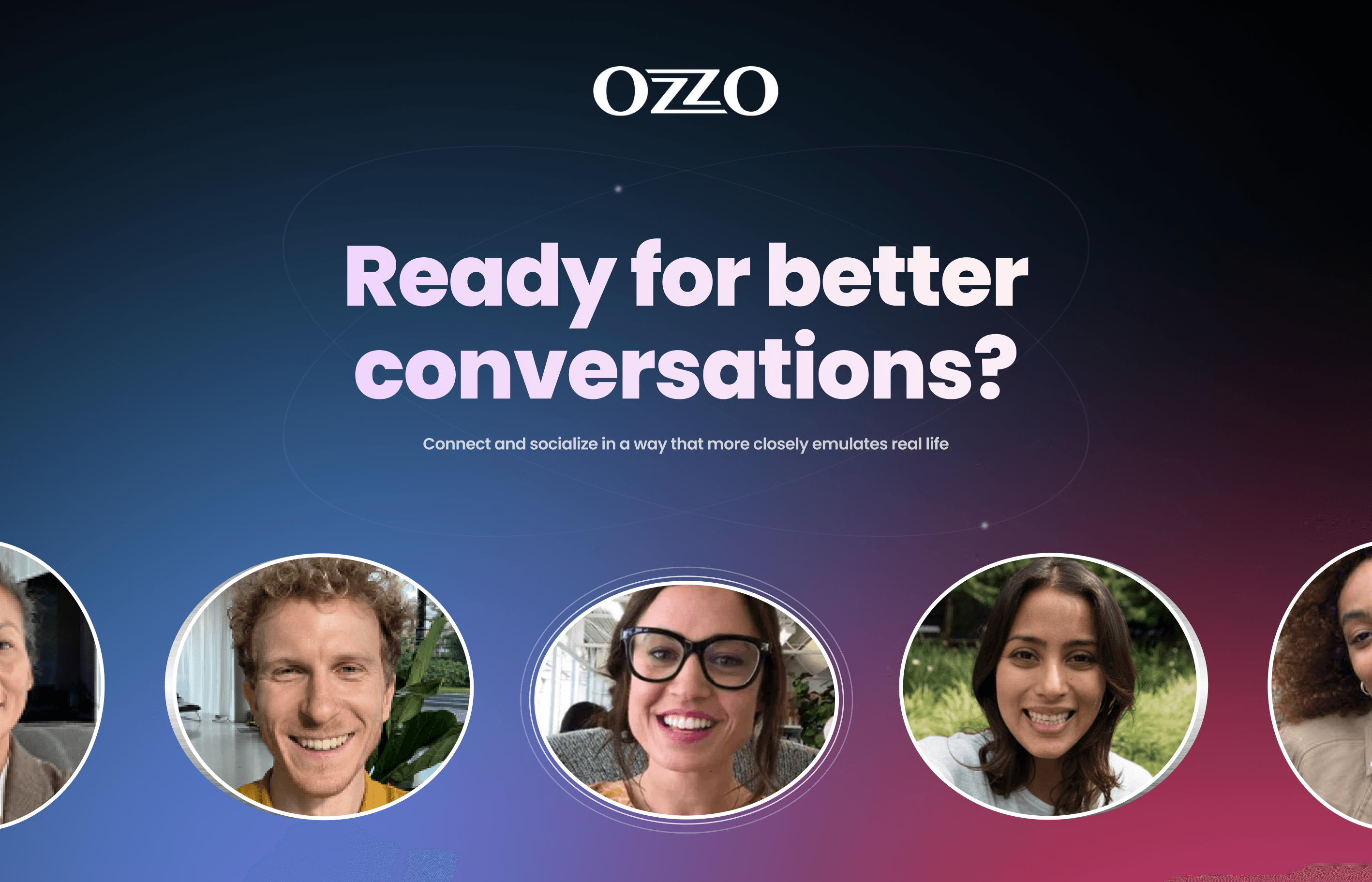
Ozzo.events redefines virtual meetings with spatial audio and immersive design, boosting engagement and streamlining event management. My redesign prioritised user experience and innovative, user-focused solutions
00
problem
Ozzo.events was created during the COVID-19 pandemic to offer a virtual meeting platform with innovative features like spatial audio for more dynamic, real-life interactions. While the core technology worked well, users had issues with the user experience (UX) and interface (UI). They found it complicated and difficult to use, which didn’t match the platform’s high-tech features. This gap between the advanced technology and the poor user experience showed that a complete redesign was needed to make the app easier to use, more visually appealing, and user-friendly.
solution
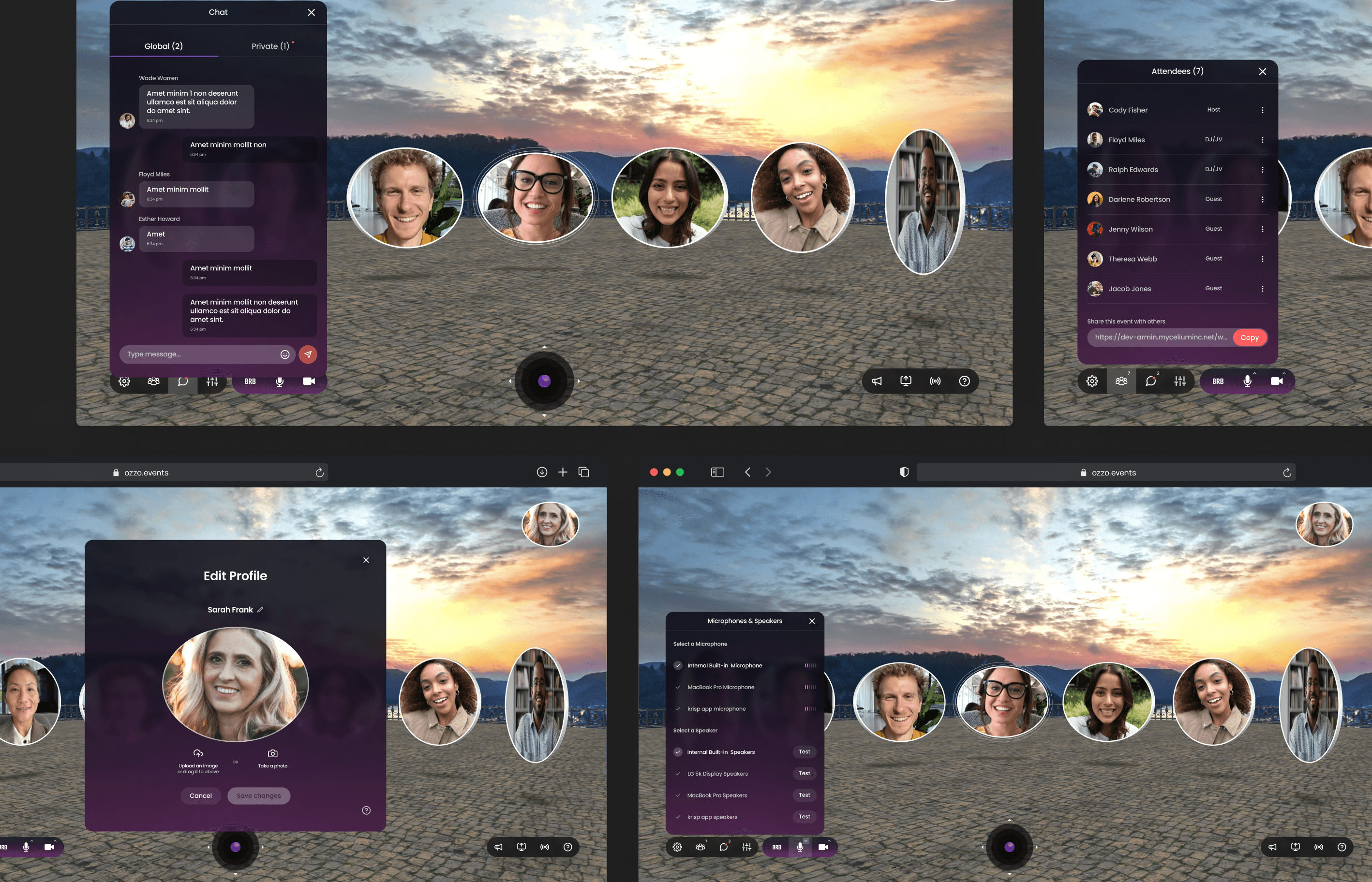
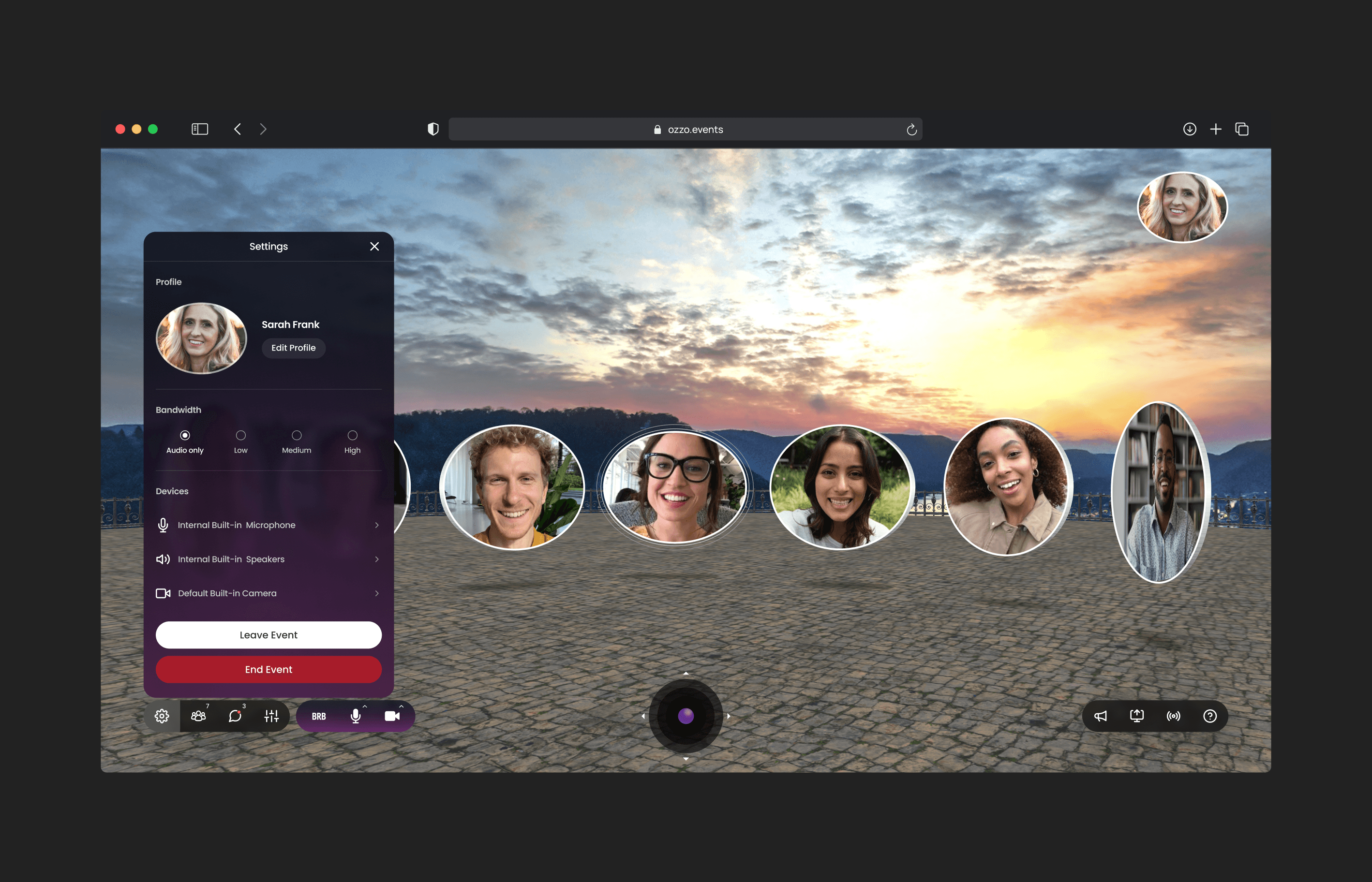
Ozzo.events approached me to lead the redesign of their web app. The goal was to create a visually engaging and scalable UI while enhancing the overall UX. I proposed a modular approach to ensure flexibility across devices and future scalability. The design aimed to blend seamlessly with the platform’s powerful technology, including improvements to the joystick navigation for easier 3D movement, a revamped user avatar system, and the development of a scalable design system. This design system, built using atomic design principles, streamlined collaboration with developers and ensured consistent, reusable components across the platform.
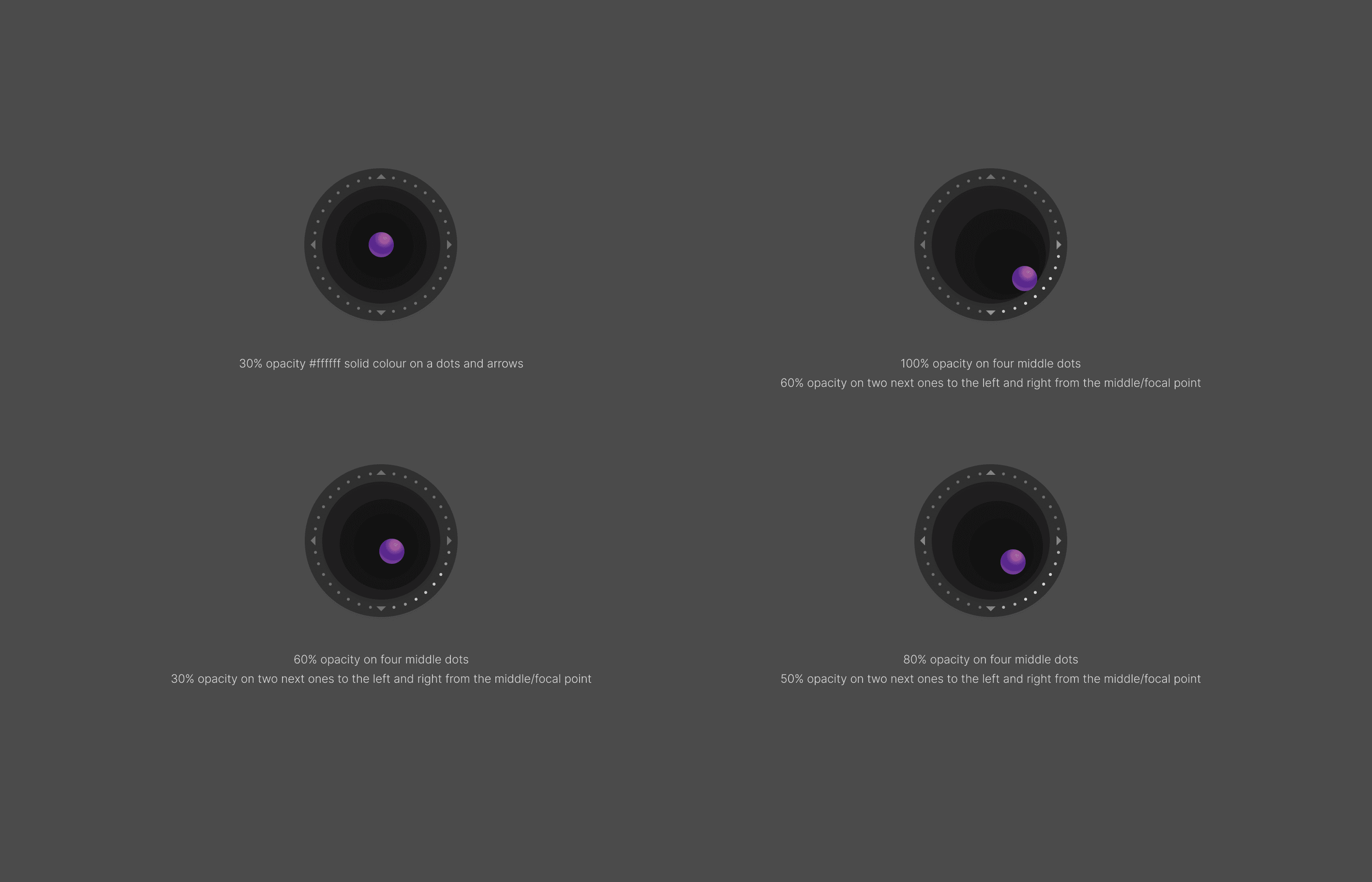
The redesign process began with in-depth research into both digital and real-world user interfaces, allowing us to draw inspiration from intuitive navigation systems. Our focus started with the joystick, a critical component of the 3D virtual workspace. After several iterations, we finalised a design that used simple visual elements like dots and arrows, making it easy for users to navigate the virtual environment.
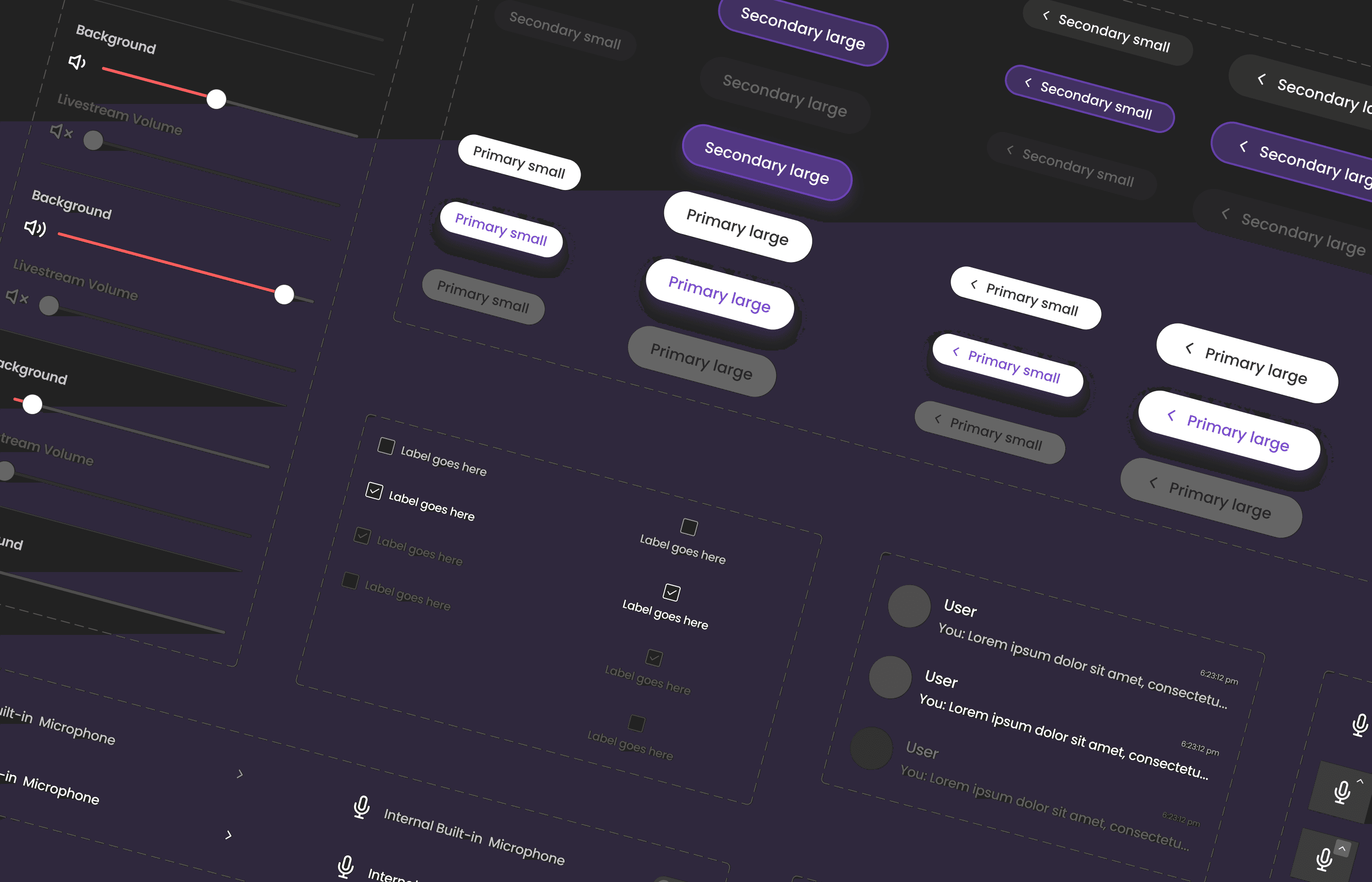
Alongside these improvements, I developed a scalable design system from scratch, which documented every component for easy updates and collaboration between design and development teams. This system allowed for faster implementation and future adaptability.
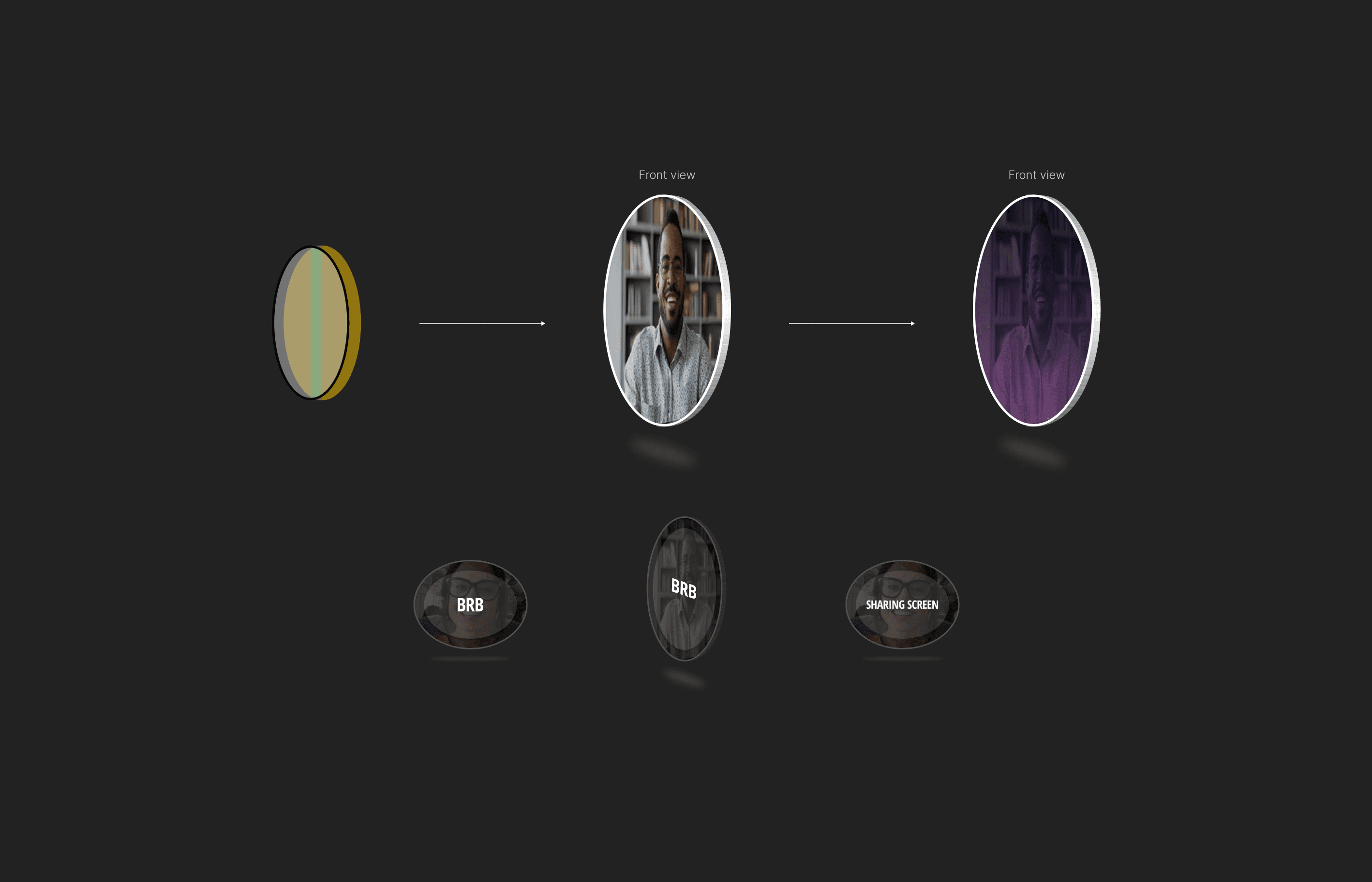
To further enhance the user experience, I redesigned the avatars, incorporating clear markers for states like ‘BRB’ and ‘Screen Sharing.’ These changes created a more dynamic, user-friendly interface while maintaining the platform’s unique identity.
Throughout the project, we tested prototypes with users, receiving positive feedback that allowed us to refine the design. The project lasted three months and proved to be a rewarding experience, as the successful redesign elevated the app’s overall user experience. Working with Ozzo.events and their innovative technologies, such as spatial audio and immersive environments, expanded my skills and highlighted the importance of user-centred design.
01
An intuitive joystick movement system that allows users to navigate seamlessly through 3D space during virtual events
02
A glimpse into the components of the Design System, built using an atomic and modular approach for flexibility and scalability
03
The redesigned 3D user avatar, showcasing different states and how it appears from various angles
04
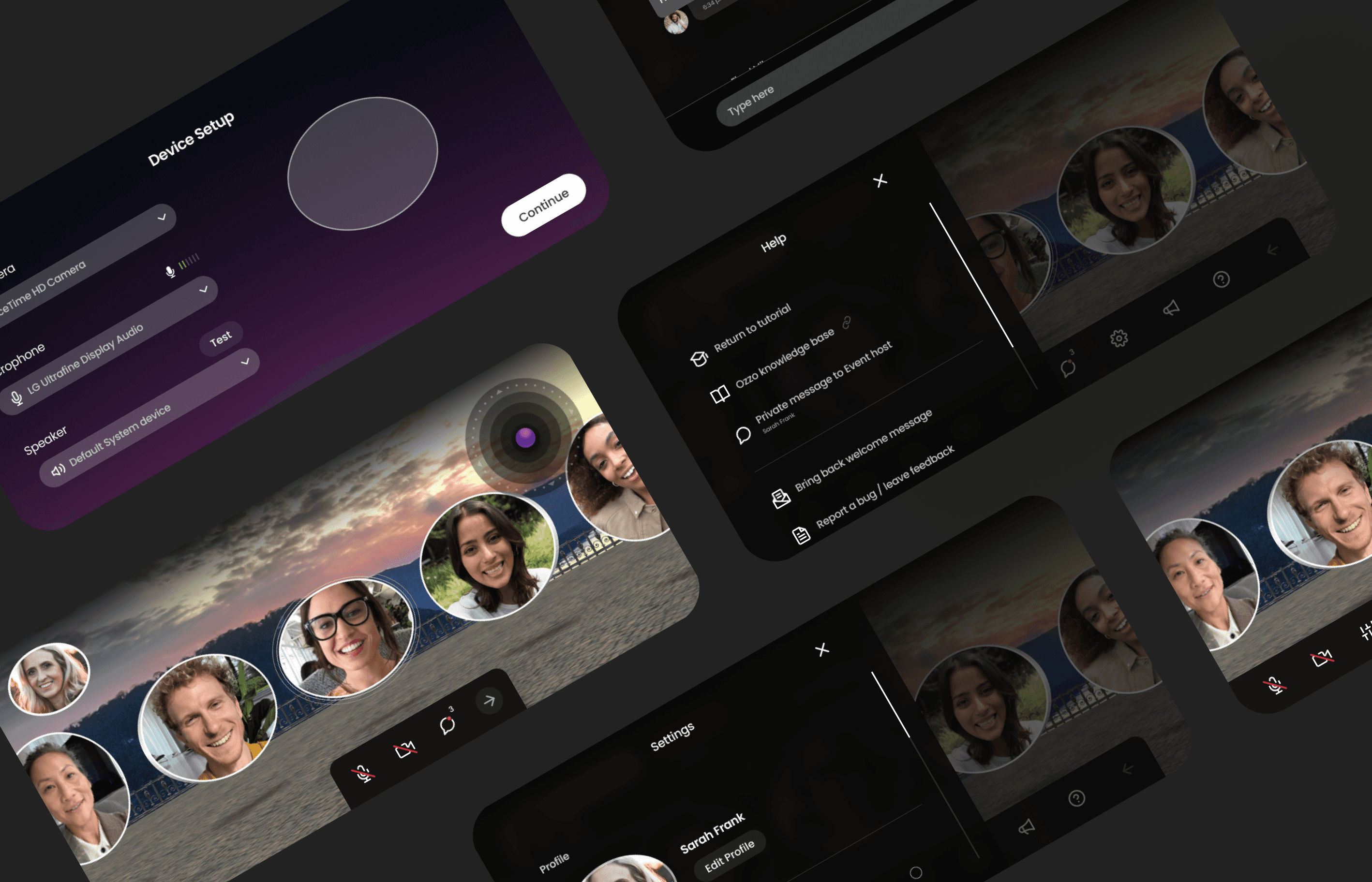
Selected screens of the redesigned web UI, demonstrating the modularity and ease of manipulation for a smoother user experience
05
Responsive versions of the web UI, ensuring a consistent and seamless experience across devices
see also
