Tools transformation and design system mastery at Sweatcoin
Introduction: seeking better collaboration and efficiency
At Sweatcoin, we realised that our fast-moving design work needed a tool that not only handled our technical needs but also made collaboration between designers and engineers easier. While Framer was useful, it lacked important features like complex component libraries and tools such as gradients on strokes and text. These gaps slowed us down and made innovation harder.
The transition process: gradual and strategic
Moving over 240 files and more than 50 projects to Figma wasn’t easy. We started with the active projects to ensure that designers could keep working smoothly. To make the transition easier, I introduced ‘Slack Fridays’ every three weeks. This gave our designers dedicated time to focus on the migration, which sped up the process and kept the team’s energy and productivity high.
Cost savings and better collaboration
Switching to Figma saved us 40% on editor seats. Unlike Framer, Figma allowed developers to view designs without needing costly editor accounts. This change made our workflow between design and development much more efficient, improving how the teams worked together.

Building a scalable design system
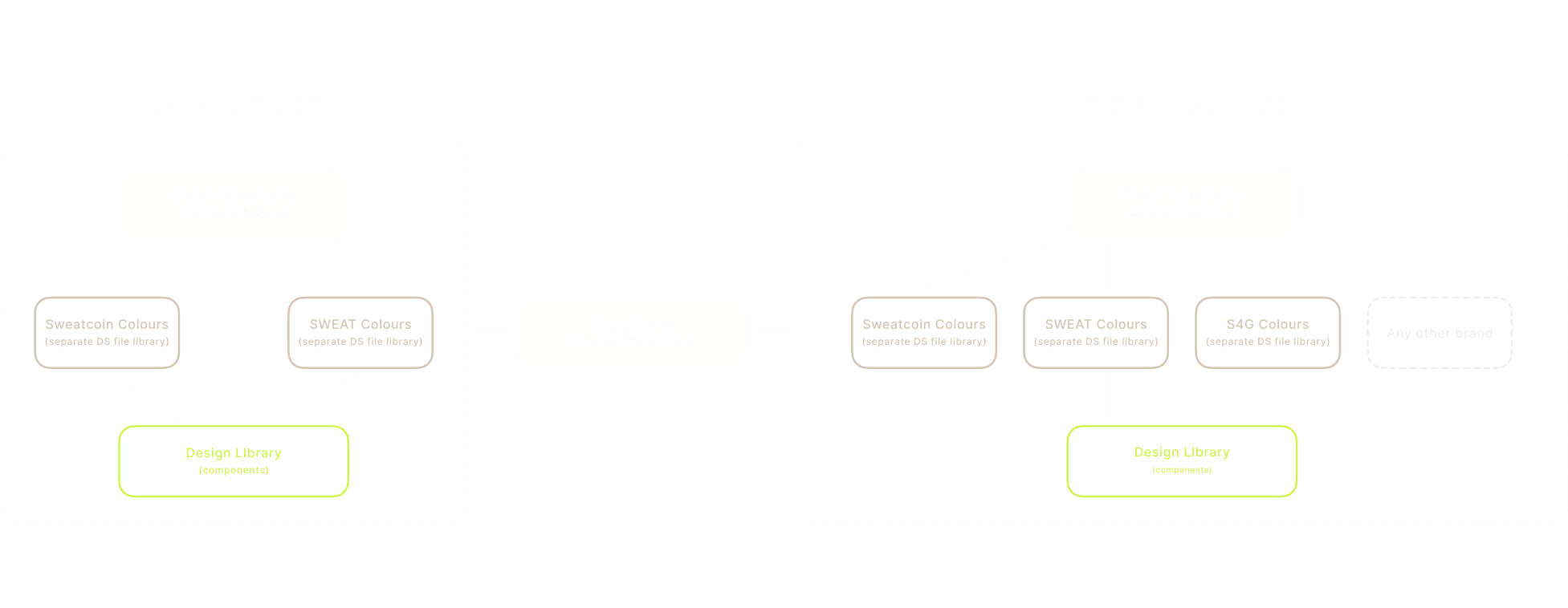
At the same time, I led the creation of a new design system in Figma. The goal was to build a system that worked for both Sweatcoin and the new Sweat Wallet brand, and could easily grow as our needs expanded.

Using tokenisation and atomic design
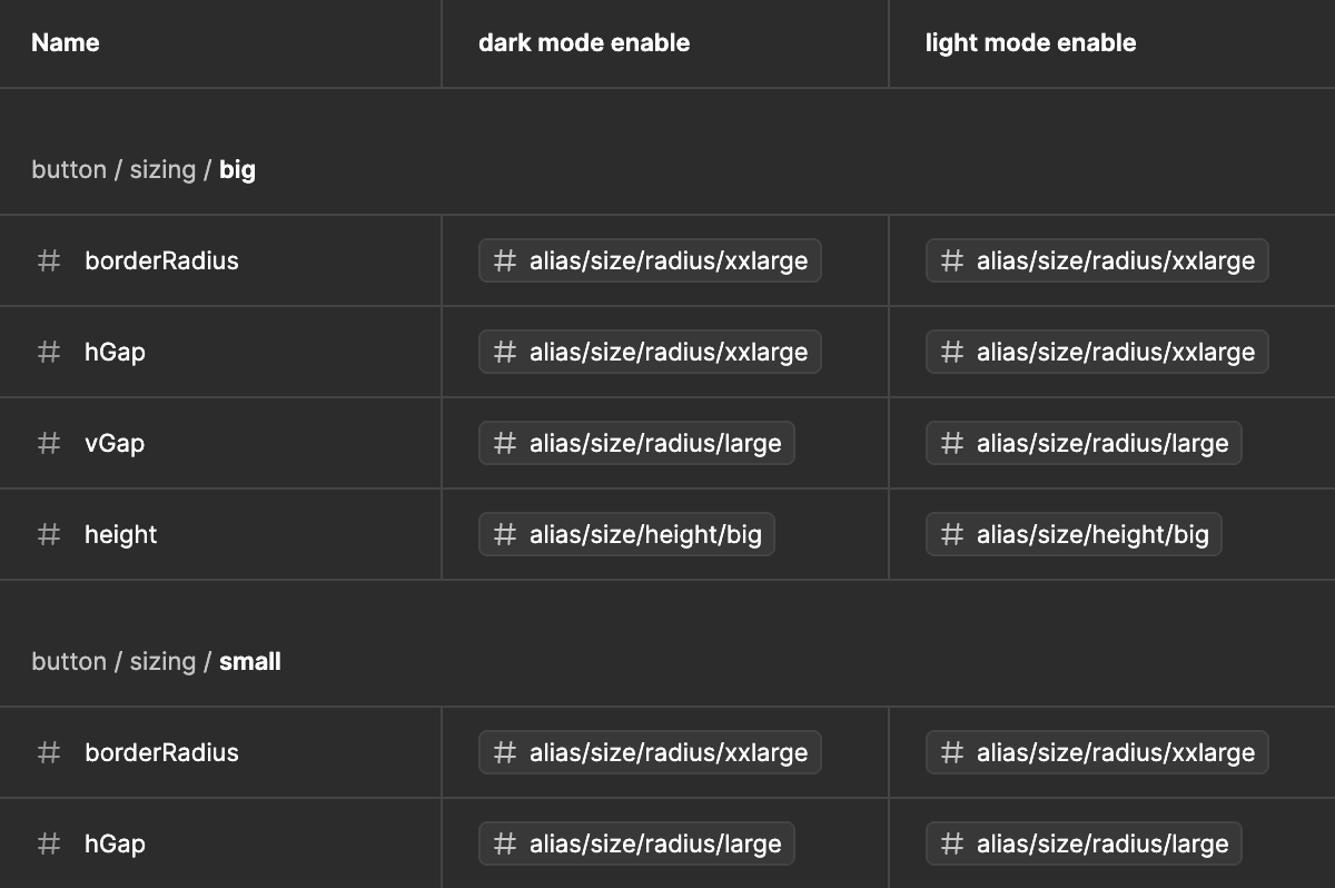
Our new design system followed the principles of tokenisation and atomic design. Tokenisation allowed us to standardise key elements like colours, fonts, and spacing, ensuring consistency across all applications. When changes were made to these tokens, they updated automatically in all designs, making the process more efficient.
Atomic design involved breaking designs down into small parts (atoms) that could be combined into reusable components (molecules and organisms). This modular system made our designs flexible and easy to use.

Clear documentation for each component
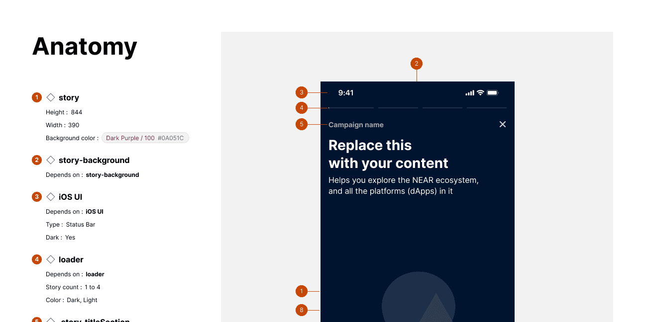
A key part of our design system was clear documentation for each component. This included how to use it, variations, and how it should be implemented. This made it simple for both designers and developers to understand and use the components, reducing the need for constant back-and-forth communication and speeding up the process.
Improving efficiency and clarity
Developing version 1.0 of our design system took about one to two months. Designers could work faster using pre-built components, making files cleaner and more organised. Developers had a single source of truth with the documentation, which meant they didn’t need to ask questions for minor details.
Conclusion: adapting with the product and brand
As we get ready to launch version 2.0 of our design system with the newest Figma features, it reminds us how important it is to keep evolving. Sweatcoin’s design system is constantly adapting and growing as our products develop. It’s a tool that inspires creativity, rather than limiting it. This change has streamlined our workflow and shown us the value of flexibility and continuous improvement in design.
.see also


